We took the brand to one of the most imortant sport events in the world through an attractive In and Out communication concept.

Zuko Soccer 2018
Packaging Design / Creative Advertising Concept

Taking advantage of green as our propietary brand color, as it is of the soccer national team shirt, we add ourselves to the passion generated by this event, projecting Zuko support to our team.
The sachette design looks like a sport shirt. It has a circular element that could be seen as a neck. The Zuko logotype has a soccer ball instead of letter “O”. It was implemented only in the most sold flavors.
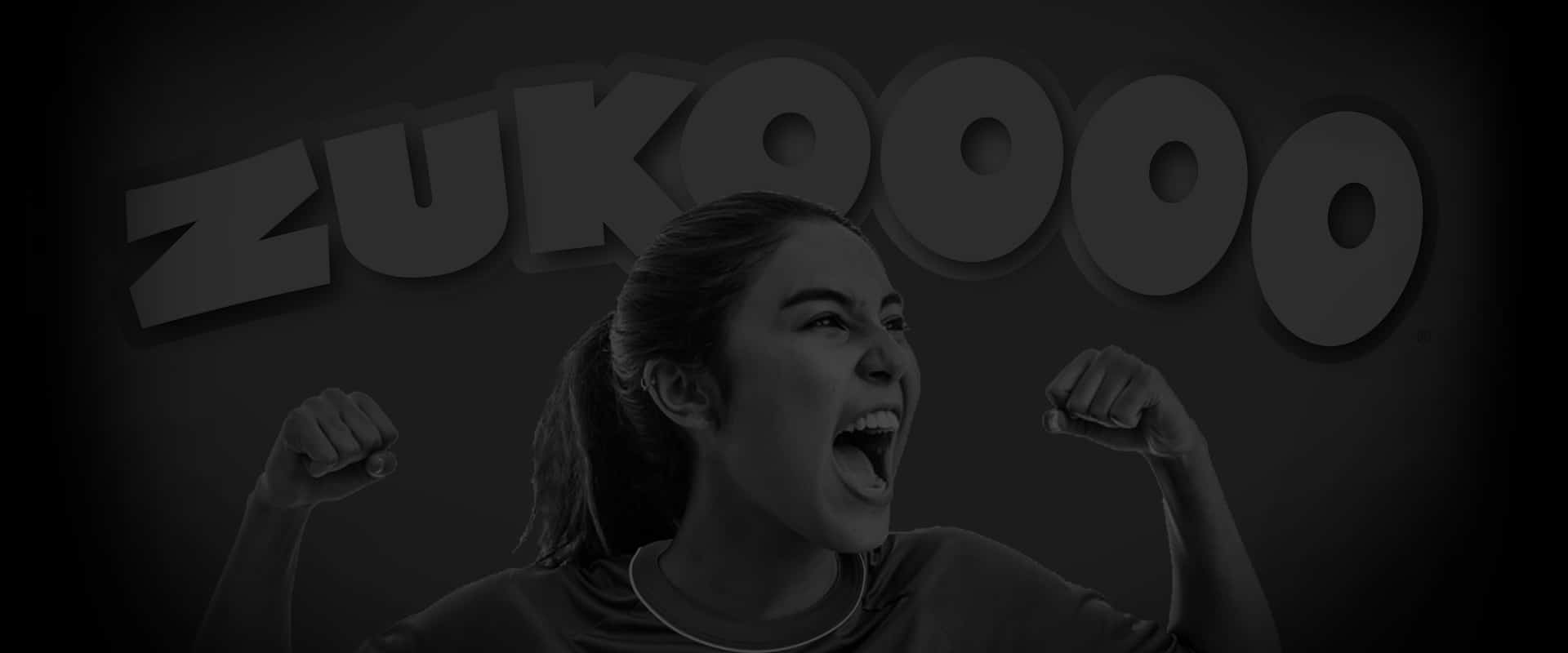
We also created the visual concepts por outdoor and point of purchase advertising, using the sachetes in the position that a team player would have had in a classic soccer picture. We used the lemon, horchata and hibiscus flavors to build a green, white and red very mexican image.


Related portfolios


